Percentile Radars/Pizza’s
Intro
Disclaimer: rotating the axis labels was never fully supported and is broken in newer versions of tidyvers/ggplot. Remove that line if you get an error.
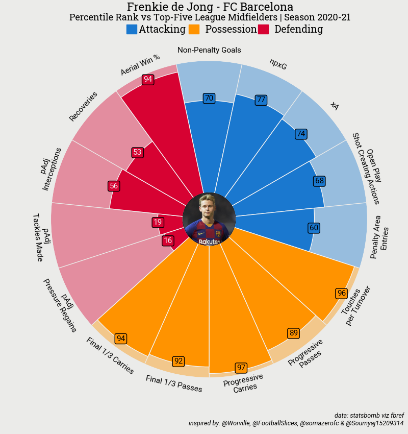
As I really like the radars/pizza charts from football slices (RIP) and the mplsoccer package for Python, I was thinking about making them in R with the help of the worldfootballR package. When some people contacted me with the question if I knew how to do it, I decided to make a tutorial for it. If you don’t know what I’m talking about, this is the radar from mplsoccer.
The Python package makes you enter te values yourself. For some leagues (Men’s Big 5 Leagues and European Competition, Major League Soccer, Women’s Super League) FBref has so called scouting reports with data from StatsBomb. These scouting reports do not only have the absolute numbers for several metrics, but also the percentiles. The worldfootballR package let’s you scrape them really easy. Let’s start by setting up our environment. If needed, install the packages first.
Getting and preparing the data
library(worldfootballR)  #for scraping
library(tidyverse)       #for ggplot, dplyr and several other stuff
library(forcats)         #for sorting within ggplot
library(glue)            #easier than paste()
I’m using the ‘Spartan’ font in all my plots, but you can use your own ofcourse. The extrafont package has a lot of nice fonts.
Next we are going to pick a player in which we are interested, as long as it’s from the leagues mentioned earlier. I’m choosing Mateusz Klich, but you can pick someone else, I’m not judging you. As mentioned before, worldfootballR has a function to scrape the scouting report.
Note: the function was updated to scrape the WHOLE scouting report. So selecting your rows need some more thought. Besides that, it also have a column called ‘StatsGroup’ so you can use this to colour your chart. Besides that, FBref switched to OPTA, so the names of the stats will be different!
df <- fb_player_scouting_report("https://fbref.com/en/players/282679b4/Mateusz-Klich")
head(df)
For some players you need to add
pos_versus = "primary"inside the function as the player played multiple positions, like this:
df <- fb_player_scouting_report("https://fbref.com/en/players/282679b4/Mateusz-Klich", pos_versus = "primary")Using other data
You can use The full scouting report as well. You only have to make the data frame yourself. A short example how to do this:
df_selected<- data.frame(player_name = "Mateusz Klich",
                         Statistic = c("Pressures (Att 3rd)",
                                       "% of dribblers tackled",
                                       "Touches (Att 3rd)",
                                       "Carries into Final Third",
                                       "Progressive Passes Rec",
                                       "Crosses"),
                         Per90 = c(4.63,
                                    16,
                                    26.11,
                                    2.55,
                                    7.22,
                                    1.32),
                         Percentile = c(92,
                                        3,
                                        94,
                                        93,
                                        98,
                                        87),
                         stat=c("Defending",
                                "Defending",
                                "Possession",
                                "Possession",
                                "Possession",
                                "Attacking"))
You can change the stat column to your liking, but you have to change the scale_fill_manuel() later on as well.
Now we can use this column to color the chart. I’m not interested in every metric though. The ‘npxG+xA’ column for instance. I already have those metrics each in my chart. To pick the metrics you want/don’t want, print the Statistic column and choose.
{::options parse_block_html=“true” /}
See all statistics
print(df$Statistic)
{::options parse_block_html=“false” /}
If you want to pick your metrics, use the statement below
df_selected <- df[c(2,3,9,10,13,28,29,47,73,107,109,116,118,126,148),]To colour them by type of the Statistic, we make a new column and fill it with “Attacking”, “Possession” or “Defending”. You can use the StatGroup column that is already provided as well, but this tutorial was made before you could scrape the whole scouting report. This is also the reason the Statistics look random. Just change it to match your data frame.
df_selected <- df_selected %>%
      mutate(stat=case_when(Statistic == "Non-Penalty Goals"|
                            Statistic == "npxG"|
                            Statistic == "Shots Total"|
                            Statistic == "Assists"|
                            Statistic == "xA"|
                            Statistic == "npxG+xA"|
                            Statistic == "Shot-Creating Actions" ~ "Attacking",
                            Statistic == "Passes Attempted"|
                            Statistic == "Pass Completion %"|
                            Statistic == "Progressive Passes"|
                            Statistic == "Progressive Carries"|
                            Statistic == "Dribbles Completed"|
                            Statistic == "Touches (Att Pen)"|
                            Statistic == "Progressive Passes Rec" ~ "Possession",
                                 TRUE ~ "Defending"))
Making the chart
To make the pizza chart, we will use geom_bar() with coord_polar(). It’s a neat little trick as there isn’t a good package to do it otherwise.
ggplot(df_selected,aes(fct_reorder(Statistic,stat),Percentile)) +                       #select the columns to plot and sort it so the types of metric are grouped
  geom_bar(aes(y=100,fill=stat),stat="identity",width=1,colour="white",                 #make the whole pizza first
  alpha=0.5) +                                                                          #change alphe to make it more or less visible
  geom_bar(stat="identity",width=1,aes(fill=stat),colour="white") +                     #insert the values
  coord_polar() +                                                                       #make it round
  geom_label(aes(label=Per90,fill=stat),size=2,color="white",show.legend = FALSE)+     #add a label for the value. Change 'label=Per.90' to 'label=Percentile' to show the percentiles
 scale_fill_manual(values=c("Possession" = "#D70232",                                   #choose colors to fill the pizza parts
                             "Attacking" = "#1A78CF",
                             "Defending" = "#FF9300")) +
  scale_y_continuous(limits = c(-10,100))+                                              #create the white part in the middle.
  labs(fill="",                                                                         #remove legend title
       caption = "Data from StatsBomb via FBref",                                       #credit FBref/StatsBomb
       title=df_selected$Player[1])+                                                    #let the title be te name of the player

  theme_minimal() +                                                                     #from here it's only themeing.
  theme(legend.position = "top",
        axis.title.y = element_blank(),
        axis.title.x = element_blank(),
        axis.text.y = element_blank(),
        text = element_text(family="Spartan-Light"),                                    #I downloaded this font from Google Fonts. You can use your own font of course
        plot.title = element_text(hjust=0.5),
        plot.caption = element_text(hjust=0.5,size=6),
        panel.grid.major = element_blank(),
        panel.grid.minor = element_blank())
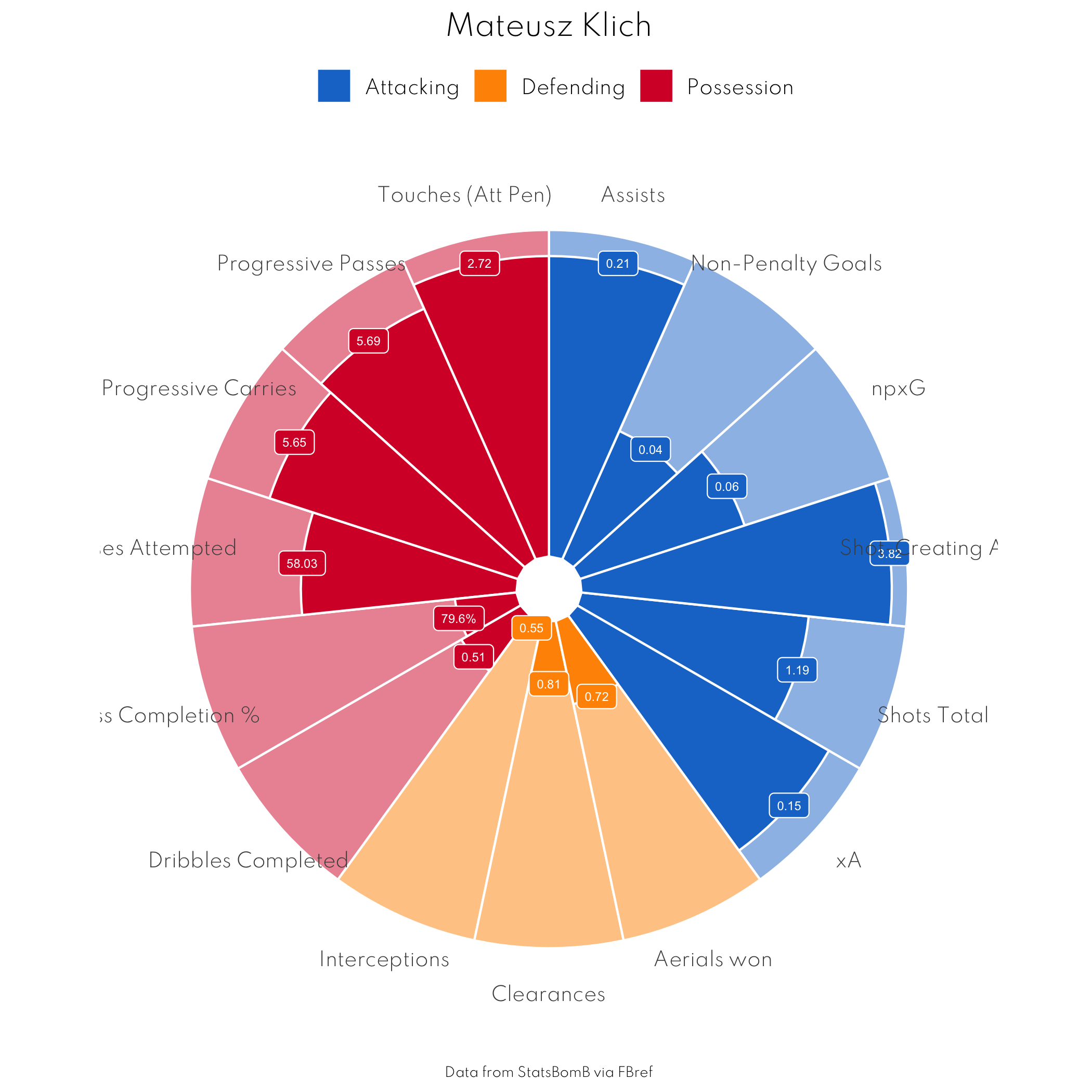
Doesn’t look half bad, but the labels are horrible. Besides that we should add some extra information about the player. The labels need to be rotated so they look better. We can do this by hand, but if we change the number of metrics we’re using we need to do it all over again. So let’s just make a calculation that we can run everytime we make a new chart. I chose to display the ‘Per 90’ stats insteadd of the percentiles. You can change this in geom_label().
temp <- (360/(nrow(df_selected))/2)                             #find the difference in angle between to labels and divide by two.
myAng <- seq(-temp, -360+temp, length.out = nrow(df_selected))  #get the angle for every label
ang<-ifelse(myAng < -90, myAng+180, myAng)                                    #rotate label by 180 in some places for readability
ang<-ifelse(ang < -90, ang+180, ang)                                          #rotate some lables back for readability...
Because some labels are rather long (‘Progressive Passes Rec’ for instance) I decided to let every word start on a new line. I used gsub for that
df_selected$Statistic <- gsub(" ","\n",df_selected$Statistic)If we plot again and add an extra line we will get a better plot.
ggplot(df_selected,aes(fct_reorder(Statistic,stat),Percentile)) +                       #select the columns to plot and sort it so the types of metric are grouped
  geom_bar(aes(y=100,fill=stat),stat="identity",width=1,colour="white",                 #make the whole pizza first
  alpha=0.5) +                                                                          #change alphe to make it more or less visible
  geom_bar(stat="identity",width=1,aes(fill=stat),colour="white") +                     #insert the values
  coord_polar() +                                                                       #make it round
  geom_label(aes(label=Per90,fill=stat),size=2,color="white",show.legend = FALSE)+     #add a label for the value. Change 'label=Per.90' to 'label=Percentile' to show the percentiles
 scale_fill_manual(values=c("Possession" = "#D70232",                                   #choose colors to fill the pizza parts
                             "Attacking" = "#1A78CF",
                             "Defending" = "#FF9300")) +
  scale_y_continuous(limits = c(-10,100))+                                              #create the white part in the middle.
  labs(fill="",                                                                         #remove legend title
       caption = "Data from StatsBomb via FBref",                                       #credit FBref/StatsBomb
       title=df_selected$Player[1])+                                                    #let the title be te name of the player

  theme_minimal() +                                                                     #from here it's only themeing.
  theme(legend.position = "top",
        axis.title.y = element_blank(),
        axis.title.x = element_blank(),
        axis.text.y = element_blank(),
        axis.text.x = element_text(size = 6, angle = ang),
        text = element_text(family="Spartan-Light"),                                    #I downloaded this font from Google Fonts. You can use your own font of course
        plot.title = element_text(hjust=0.5),
        plot.caption = element_text(hjust=0.5,size=6),
        panel.grid.major = element_blank(),
        panel.grid.minor = element_blank())
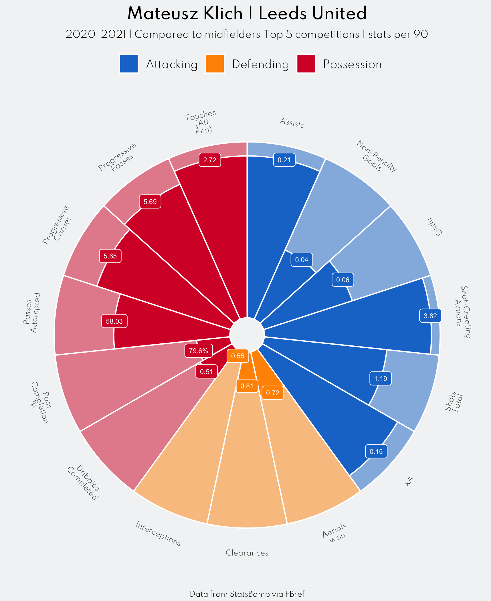
That looks much better! From here you can change everything you want. I’m going to add a subtitle, and make some theme adjustments. Adding a picture is something I will add to this tutorial in the future.
{::options parse_block_html=“true” /}
Let’s see de final code!
ggplot(df_selected,aes(fct_reorder(Statistic,stat),Percentile)) +                       #select the columns to plot and sort it so the types of metric are grouped
  geom_bar(aes(y=100,fill=stat),stat="identity",width=1,colour="white",                 #make the whole pizza first
  alpha=0.5) +                                                                          #change alphe to make it more or less visible
  geom_bar(stat="identity",width=1,aes(fill=stat),colour="white") +                     #insert the values
  coord_polar() +                                                                       #make it round
  geom_label(aes(label=Per90,fill=stat),size=2,color="white",show.legend = FALSE)+      #add a label for the value. Change 'label=Per.90' to 'label=Percentile' to show the percentiles
 scale_fill_manual(values=c("Possession" = "#D70232",                                   #choose colors to fill the pizza parts
                             "Attacking" = "#1A78CF",
                             "Defending" = "#FF9300")) +
  scale_y_continuous(limits = c(-10,100))+                                              #create the white part in the middle.
  labs(fill="",
       caption = "Data from StatsBomb via FBref",
       #remove legend title
       title=glue("{df_selected$Player[1]} | Leeds United"),
        subtitle = glue::glue("{df_selected$season} | Compared to midfielders Top 5 competitions | stats per 90"))+ #let the title be te name of the player

  theme_minimal() +                                                                     #from here it's only themeing.
  theme(plot.background = element_rect(fill = "#F2F4F5",color = "#F2F4F5"),
        panel.background = element_rect(fill = "#F2F4F5",color = "#F2F4F5"),
        legend.position = "top",
        axis.title.y = element_blank(),
        axis.title.x = element_blank(),
        axis.text.y = element_blank(),
         axis.text.x = element_text(size = 6, angle = ang),
        text = element_text(family="Spartan-Light"),                                    #I downloaded this font from Google Fonts. You can use your own font of course
        plot.title = element_markdown(hjust=0.5,family="Spartan-Medium"),
        plot.subtitle = element_text(hjust=0.5,size=8),
        plot.caption = element_text(hjust=0.5,size=6),
        panel.grid.major = element_blank(),
        panel.grid.minor = element_blank(),
plot.margin = margin(5,2,2,2)) {::options parse_block_html=“false” /}
Note: with coord_polar() in combination with a background colour, I need to trim the image afterwards. I do this with a commandline (on mac OSX) statement in my R session:
system("convert -trim image.png new_image.png")Where image.png is my just saved image and new_image.png will be the trimmed one. There is also an option to add the color to ggsave:
ggsave("image.png",bg="#F2F4F5")You can add the resolution to ggsave() if the quality is poor.
I prefer to trim it, as it removes unnecessary parts from the plot.
Some other (well known) styles
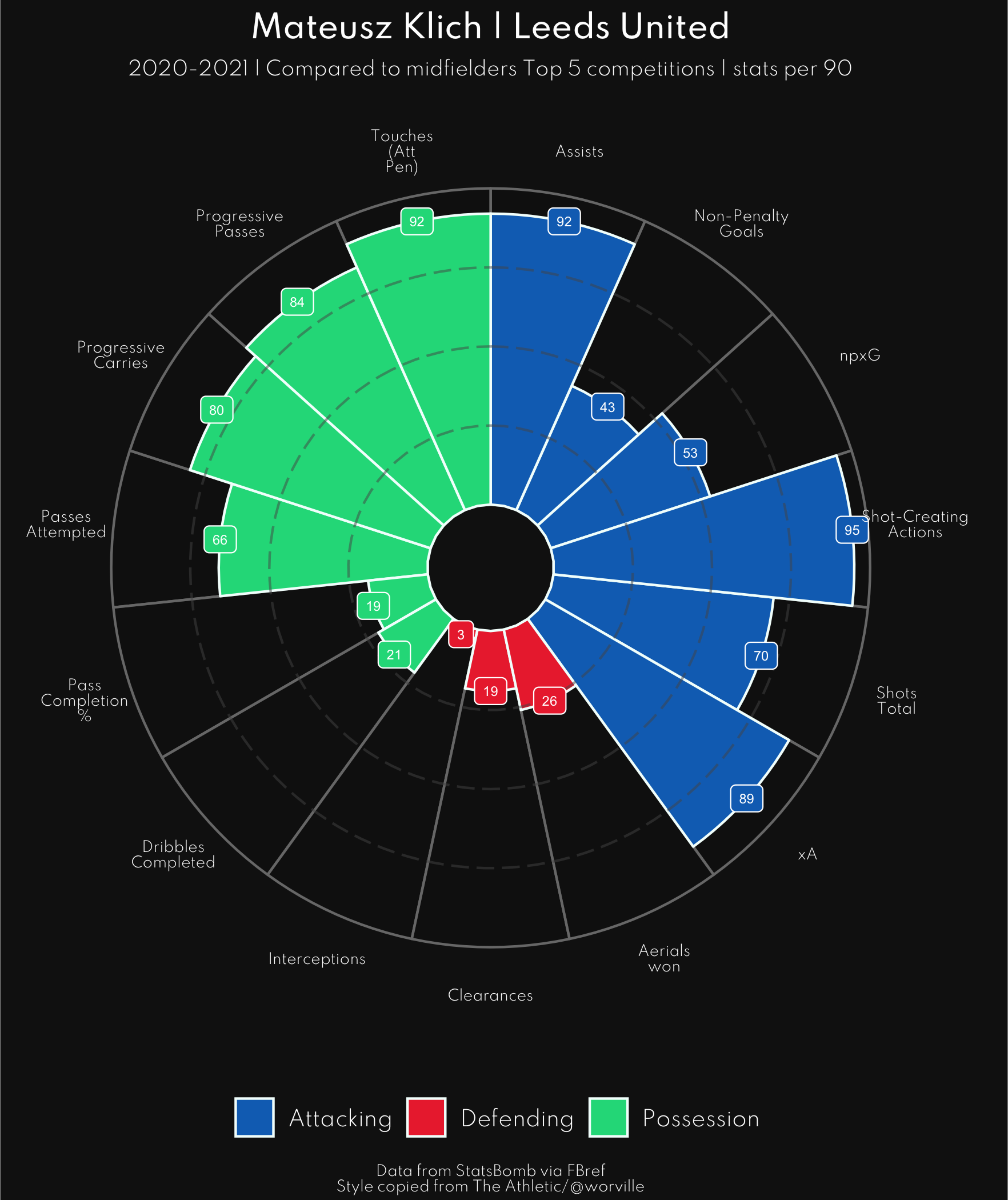
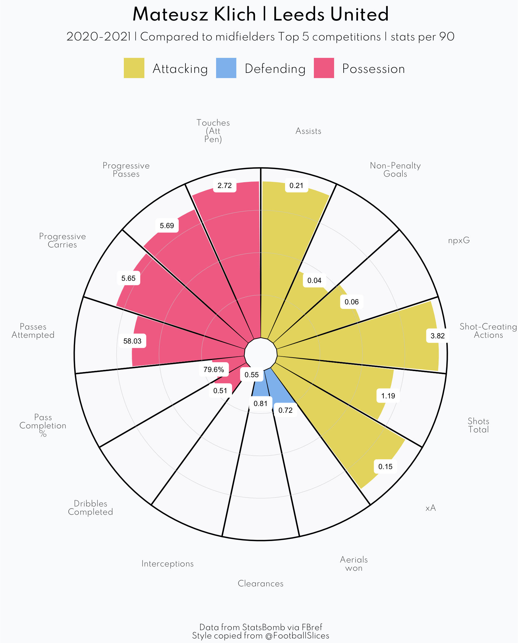
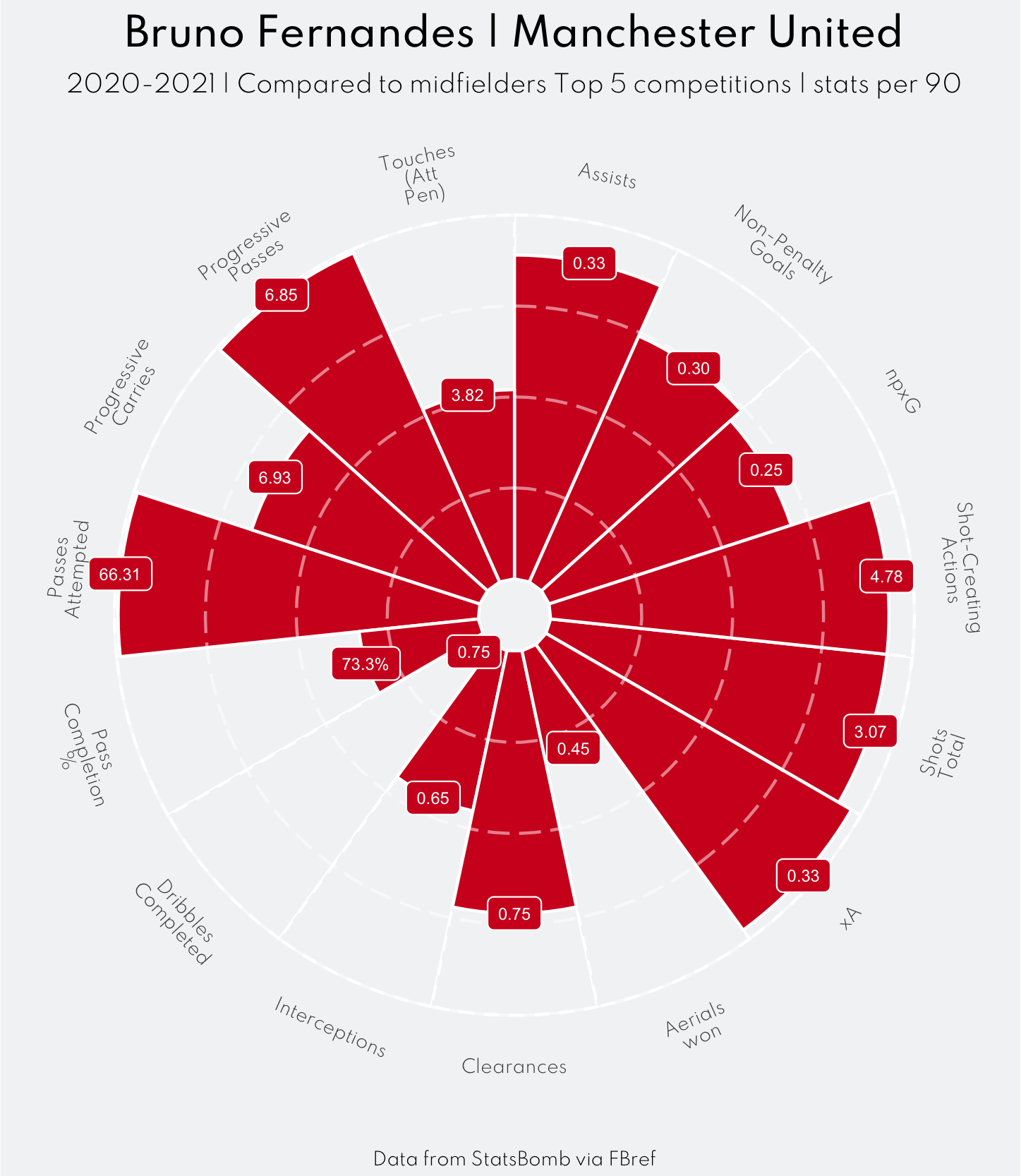
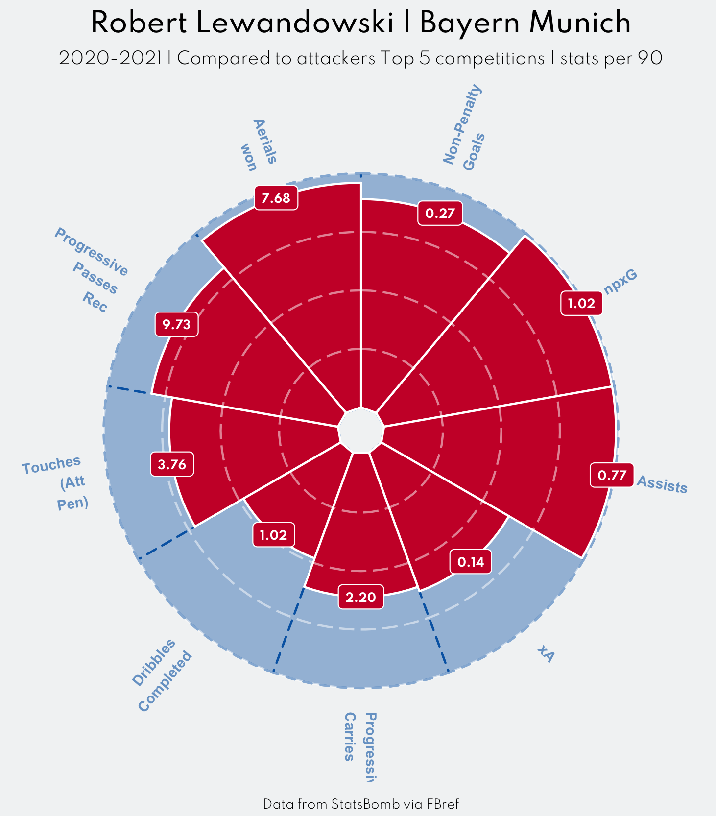
Some examples, with some well known styles included. Just a head start to create your own style and learn about how the different elements of ggplot work. Play around with colours/fonts/grid lines etc. to create something unique!
The Athletic/ Tom Worville
The code
ggplot(df_selected,aes(fct_reorder(Statistic,stat),Percentile)) +
  geom_bar(aes(y=100),fill="#131313",stat="identity",width=1,colour="#797979",
  alpha=0.5,show.legend = FALSE) +


  geom_bar(stat="identity",width=1,aes(fill=stat),colour="#F3FEFC",alpha=1) +
  coord_polar(clip = "off") +
     geom_hline(yintercept=25, colour="#565656",linetype="longdash",alpha=0.5)+
  geom_hline(yintercept=50, colour="#565656",linetype="longdash",alpha=0.5)+
  geom_hline(yintercept=75, colour="#565656",linetype="longdash",alpha=0.5)+
 scale_fill_manual(values=c("Possession" = "#1ADA89",
                             "Attacking" = "#0F70BF",
                             "Defending" = "#EC313A")) +
   geom_label(aes(label=Percentile,fill=stat),size=2,color="white",show.legend = FALSE)+
  scale_y_continuous(limits = c(-20,100))+
  labs(fill="",
       caption = "Data from StatsBomb via FBref\nStyle copied from The Athletic/@worville",
       #remove legend title
       title=glue("{df_selected$Player[1]} | Leeds United"),
        subtitle = glue::glue("{df_selected$season} | Compared to midfielders Top 5 competitions | stats per 90"))+
  theme_minimal() +
  theme(plot.background = element_rect(fill = "#131313",color = "#131313"),
        panel.background = element_rect(fill = "#131313",color = "#131313"),
        legend.position = "bottom",
        axis.title.y = element_blank(),
        axis.title.x = element_blank(),
        axis.text.y = element_blank(),
        axis.text.x = element_text(size = 6,colour = "#FFFFFF"),
        text = element_text(family="Spartan-Light",colour= "#FEFEFE"),
        plot.title = element_markdown(hjust=0.5,family="Spartan-Medium"),
        plot.subtitle = element_text(hjust=0.5,size=8),
        plot.caption = element_text(hjust=0.5,size=6),
        panel.grid.major = element_blank(),
        panel.grid.minor = element_blank(),
        plot.margin = margin(5,4,2,4))
Football Slices
{::options parse_block_html=“true” /}
The code
ggplot(df_selected,aes(fct_reorder(Statistic,stat),Percentile)) +
  geom_bar(aes(y=100),fill="#FAFBFD",stat="identity",width=1,colour="black",
  alpha=0.5) +
  geom_bar(stat="identity",width=0.95,aes(fill=stat),colour=NA) +
  coord_polar(clip = "off") +

   geom_hline(yintercept=25, colour="#CFD0D2",alpha=1,size=0.1)+
  geom_hline(yintercept=50, colour="#CFD0D2",alpha=1,size=0.1)+
  geom_hline(yintercept=75, colour="#CFD0D2",alpha=1,size=0.1)+
   geom_text(aes(label=Per90,fill=stat),size=2,color="black",show.legend = FALSE)+
 scale_fill_manual(values=c("Possession" = "#F47294",
                             "Attacking" = "#E7D96E",
                             "Defending" = "#8FBFEF")) +
  scale_y_continuous(limits = c(-10,110))+
  labs(fill="",
       caption = "Data from StatsBomb via FBref\nStyle copied from @FootballSlices",
       #remove legend title
       title=glue("{df_selected$Player[1]} | Leeds United"),
        subtitle = glue::glue("{df_selected$season} | Compared to midfielders Top 5 competitions | stats per 90"))+
  theme_minimal() +
  theme(plot.background = element_rect(fill = "#FAFBFD",color = "#FAFBFD"),
        panel.background = element_rect(fill = "#FAFBFD",color = "#FAFBFD"),
        legend.position = "top",
        axis.title.y = element_blank(),
        axis.title.x = element_blank(),
        axis.text.y = element_blank(),
         axis.text.x = element_text(size = 6),
        text = element_text(family="Spartan-Light"),
        plot.title = element_markdown(hjust=0.5,family="Spartan-Medium"),
        plot.subtitle = element_text(hjust=0.5,size=8),
        plot.caption = element_text(hjust=0.5,size=6),
        panel.grid.major = element_blank(),
        panel.grid.minor = element_blank(),
        plot.margin = margin(5,2,2,2))
{::options parse_block_html=“false” /}
One with no background
{::options parse_block_html=“true” /}
The code
ggplot(df_selected,aes(fct_reorder(Statistic,stat),Percentile)) +
  geom_bar(aes(y=100),fill="#F2F4F5",stat="identity",width=1,colour="white",
           alpha=1,linetype="dashed") +
  geom_bar(stat="identity",width=1,fill="#D20222",colour="white") +
  geom_hline(yintercept=25, colour="white",linetype="longdash",alpha=0.5)+
  geom_hline(yintercept=50, colour="white",linetype="longdash",alpha=0.5)+
  geom_hline(yintercept=75, colour="white",linetype="longdash",alpha=0.5)+
  geom_hline(yintercept=100, colour="white",alpha=0.5)+
  coord_polar() +
  geom_label(aes(label=Per90),fill="#D20222",size=2,color="white",show.legend = FALSE)+
  scale_fill_manual(values=c("Possession" = "#D70232",
                             "Attacking" = "#1A78CF",
                             "Defending" = "#FF9300")) +
  scale_y_continuous(limits = c(-10,100))+
  labs(fill="",
       caption = "Data from StatsBomb via FBref",
       #remove legend title
       title=glue("{df_selected$Player[1]} | Manchester United"),
       subtitle = glue::glue("{df_selected$season} | Compared to midfielders Top 5 competitions | stats per 90"))+

  theme_minimal() +
  theme(plot.background = element_rect(fill = "#F2F4F5",color = "#F2F4F5"),
        panel.background = element_rect(fill = "#F2F4F5",color = "#F2F4F5"),
        legend.position = "top",
        axis.title.y = element_blank(),
        axis.title.x = element_blank(),
        axis.text.y = element_blank(),
        axis.text.x = element_text(size = 6, angle = ang),
        text = element_text(family="Spartan-Light"),
        plot.title = element_markdown(hjust=0.5,family="Spartan-Medium"),
        plot.subtitle = element_text(hjust=0.5,size=8),
        plot.caption = element_text(hjust=0.5,size=6),
        panel.grid.major = element_blank(),
        panel.grid.minor = element_blank(),
        plot.margin = margin(5,2,2,2))
{::options parse_block_html=“false” /}
One with other labels and background colour
{::options parse_block_html=“true” /}
The code
label_data <- df_selected

# calculate the ANGLE of the labels
number_of_bar <- nrow(label_data)
label_data$id <- seq(1,length(label_data$player_name))
angle <-  90 - 360 * (label_data$id-0.5) /number_of_bar     # I substract 0.5 because the letter must have the angle of the center of the bars. Not extreme right(1) or extreme left (0)

# calculate the alignment of labels: right or left
# If I am on the left part of the plot, my labels have currently an angle < -90
label_data$hjust<-ifelse( angle < -90, 1, 0)

# flip angle BY to make them readable
label_data$angle<-ifelse(angle < -90, angle+180, angle)


ggplot(df_selected,aes(fct_reorder(Statistic,stat),Percentile)) +
  geom_bar(aes(y=100),fill="#0066B2",stat="identity",width=1,colour="#0066B2",
           alpha=0.4,linetype="dashed") +
  geom_bar(stat="identity",width=1,fill="#CC0033",colour="white") +
  geom_hline(yintercept=25, colour="white",linetype="longdash",alpha=0.5)+
  geom_hline(yintercept=50, colour="white",linetype="longdash",alpha=0.5)+
  geom_hline(yintercept=75, colour="white",linetype="longdash",alpha=0.5)+
  geom_hline(yintercept=100, colour="white",alpha=0.5)+
  coord_polar() +
  geom_label(aes(label=Per90),fill="#CC0033",size=2,color="white",show.legend = FALSE,family="Spartan-Bold")+
  scale_fill_manual(values=c("Possession" = "#D70232",
                             "Attacking" = "#1A78CF",
                             "Defending" = "#FF9300")) +
  scale_y_continuous(limits = c(-10,110))+
  labs(fill="",
       caption = "Data from StatsBomb via FBref",
       #remove legend title
       title=glue("{df_selected$Player[1]} | Bayern Munich"),
       subtitle = glue::glue("{df_selected$season} | Compared to attackers Top 5 competitions | stats per 90"))+
  geom_text(data=label_data, aes(x=id, y=100+10, label=Statistic, hjust=hjust),
      color="#0066B2", fontface="bold",alpha=0.6, size=2.5, angle= label_data$angle, inherit.aes = FALSE )  +
  theme_minimal() +
  theme(plot.background = element_rect(fill = "#F2F4F5",color = "#F2F4F5"),
        panel.background = element_rect(fill = "#F2F4F5",color = "#F2F4F5"),
        legend.position = "top",
        axis.title.y = element_blank(),
        axis.title.x = element_blank(),
        axis.text.y = element_blank(),
       # axis.text.x = element_text(size = 6, angle = ang),
        axis.text.x = element_blank(),
        text = element_text(family="Spartan-Light"),
        plot.title = element_markdown(hjust=0.5,family="Spartan-Medium"),
        plot.subtitle = element_text(hjust=0.5,size=8),
        plot.caption = element_text(hjust=0.5,size=6),
        panel.grid.major = element_blank(),
        panel.grid.minor = element_blank(),
        plot.margin = margin(5,2,2,2))
{::options parse_block_html=“false” /}
If you have any questions, contact me on Twitter. and please tag me if you make a chart yourself! Love to see what people make of it.

 Support Me on Ko-fi